

Your subscribers check emails on every screen imaginable, from phones to tablets to desktops. If your message looks awkward or broken, you risk losing their attention before they read the content.
A responsive email adapts itself in real time. Layout, images, buttons, and text all shift to fit the device, whether it’s a phone balanced on a dashboard or a wide desktop in an office. There’s no guessing or hoping it looks right. A responsive design guarantees every recipient sees what you intended.
Responsive goes beyond flexible widths and resizable pictures. Fonts, spacing, tappable buttons, and even the way images load all affect whether your message lands or gets trashed. Small choices change outcomes: a button too close to the edge, a headline that spills offscreen, an image that refuses to scale.
Responsive email is about trust. When your message arrives looking crisp, readable, and effortless, you send a signal. You respect your audience’s time, and you know how they work. That’s the entry fee for reaching a busy inbox now. What happens next depends on every detail you choose from here.
Why Responsive Email Matters in 2025
A sales manager builds a campaign that feels airtight on desktop. By noon, half the list has checked it from their phones. The main headline gets squeezed below the fold, the call-to-action button half-covers the product image, and two sentences clip off mid-word. Clicks disappear. The offer falls into the background.
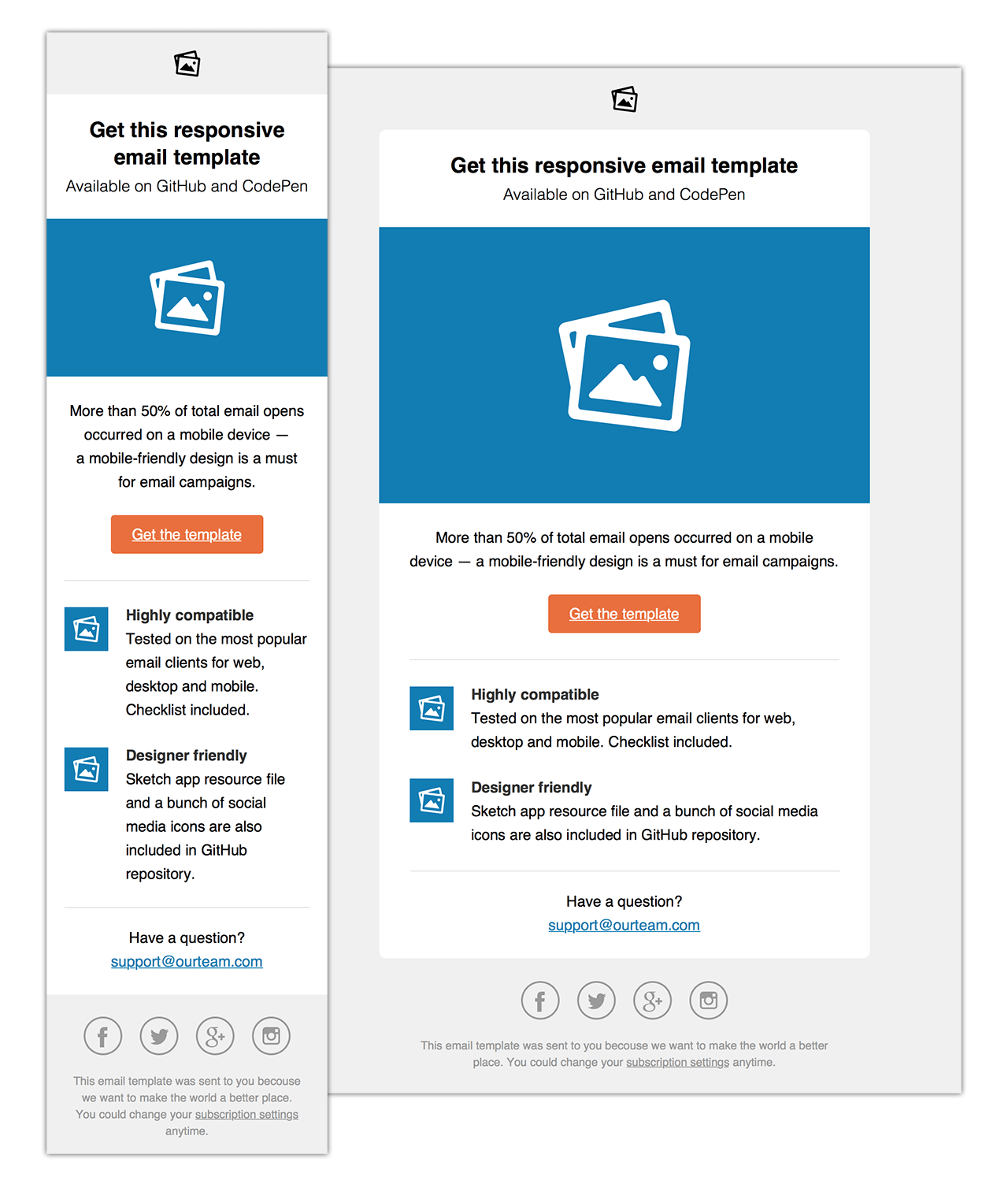
This is where most business emails run aground. Inbox competition is brutal; attention lasts seconds. One formatting flaw (whether it’s tiny text, a button too slim to tap, or images that stubbornly won’t resize), and momentum is lost. Here’s an example of what a responsive email looks like in practice:
These issues creep in for simple reasons. Multi-column layouts don’t flex when the screen shrinks. Images load at full desktop size, pushing everything else below the scroll line. Styles that work in one client look broken in the next.
Each mistake costs something concrete: a reply that doesn’t come, a lead that never moves, a brand touchpoint that feels careless instead of polished. Teams sometimes scramble to fix layouts for each device, but the manual rework grows fast. This is why tools like Instantly have become essential. Instantly applies responsive email campaign templates and auto-adjusts content blocks, so every message stays sharp from mobile to desktop.
Responsive isn’t a design trend. It determines whether your message lands with impact or vanishes in the daily flood.
Anatomy of a Responsive Email (with Examples)
Responsive email design rewards fast eyes and tired thumbs. On mobile, your window for attention shrinks to a single glance, and every extra tap or scroll cuts your odds of winning a response. The right structure clears a path from headline to call to action (CTA)—no guesswork, no wasted motion.
The most effective emails rely on simple rules: single columns for natural flow, buttons that never fade into the background, and images that never break your message or slow down a busy reader. Each detail moves the reader forward or costs you the click.
Here’s how the Airtable Assistant product launch gets it right (and what you can borrow for your own campaigns).
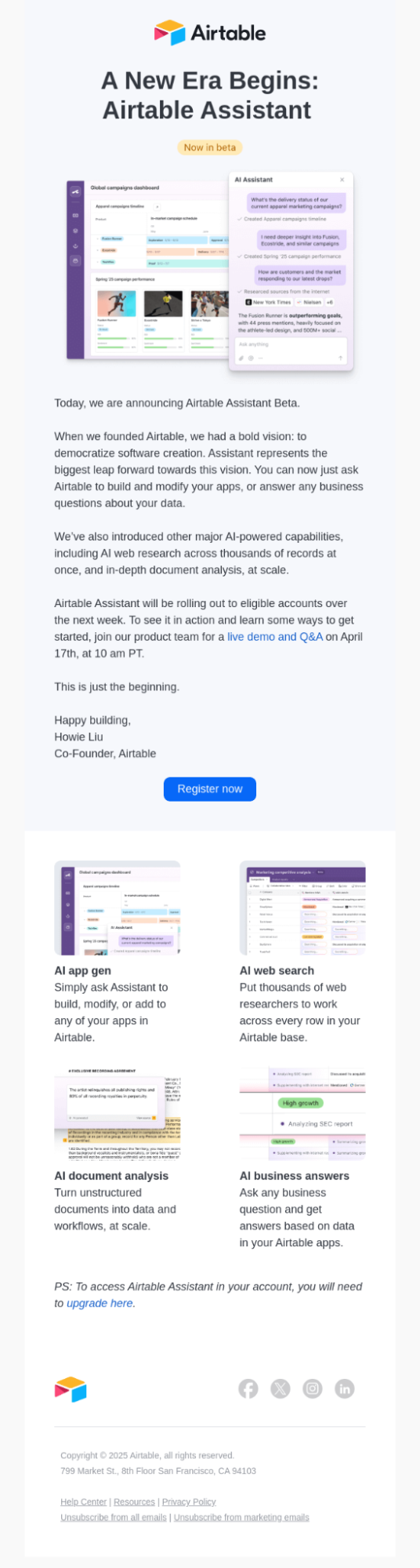
- Layout (Clear, Linear, Unmissable): Airtable’s email uses a single-column design that pulls the reader smoothly from headline to CTA. No distractions, no visual noise. Everything stacks logically, and the eye never gets lost between competing sections. On desktop, it’s inviting; on mobile, it feels custom-built for the screen in your hand.
- Buttons (Designed for Action): The “Register now” button is impossible to miss. It sits on its own line, sized for tapping, not just clicking. There’s space above and below, so even when the entire message shrinks, the call to action stands out and stays usable.
- Images (Context, Not Clutter): Screenshots of each feature land right above their descriptions, automatically resizing to fit any device. Nothing is cut off or squished. Each product visual is paired with sharp alt text, so the reader never misses the story, even if images don’t load.
- Headlines and Sections (Hierarchy That Guides): A clear, bold headline—“A New Era Begins: Airtable Assistant Now in beta”—sets the stage, immediately followed by supporting details and a personal sign-off. Features are each broken out with their own subhead, summary, and screenshot, making it easy to scan or dive deep.
- Features (Vertical Flow, Instant Comprehension): Each new capability gets its own spotlight: a headline, a crisp summary, and a dedicated screenshot. The entire email feels like a guided walkthrough—no guesswork required. The result? A product announcement that keeps attention, increases clicks, and helps the reader see what’s new.
Responsive structure isn’t just for looks. It’s the difference between an announcement that gets read and acted on and one that gets swiped away. With platforms like Instantly.ai, building and testing these layouts happens in real time, so every campaign meets your highest standard, everywhere it’s opened.
How to Write Responsive Email Content That Converts
Responsive design brings people to your message. Responsive writing keeps them there and moves them toward action. The best email campaigns aren’t just mobile-friendly in appearance; they’re tuned for the way mobile readers process information: fast, impatient, and focused on what’s next.
Short Sentences, Clear Intent
Subject lines and preheaders set the tone. If your subject line runs over 40-50 characters, it’ll get chopped on most phones. A tight, specific headline draws the thumb and the eye. Use preview text to add context or urgency, but keep it direct. Long introductions or extra storytelling fade fast on mobile.
Inside, every sentence should do one thing: deliver value, move the story, or highlight a next step. Walls of text make readers bounce. Break content into two- or three-sentence paragraphs. Force clarity by starting each main idea with a claim or question, then backing it up right away.
Hierarchy and Scannability
Use headers and subheads to create stops on the page. Even on the smallest screens, a strong section headline keeps people oriented. Bold key points, but don’t overdo it; reserve emphasis for the information that truly helps someone make a decision.
Bullet points work, but not in endless lists. Instead, mix them with short blocks of copy so each takeaway lands on its own. When you need a reader to notice something (like a CTA, a deadline, or a benefit), place it high, above the fold, and near a line break.
Calls to Action That Work
Every email should guide the reader toward one obvious next step. Too many choices dilute clicks. Make your call to action a button, not just a link, and state exactly what will happen: “Register Now,” “See How It Works,” or “Get Early Access.” Surround the button with white space so it stands out, and check that it’s at least 44 pixels tall for easy tapping.
Don’t hide your CTA at the bottom, especially on mobile. Place your main button where it’s visible without scrolling, and repeat it at the end if your message runs long.
Personalization That Matters
Email personalization is much more than inserting a name. Mention the specific challenge, use case, or product detail that matches what the recipient cares about. Reference new features they haven’t tried, recent activity, or an industry trend—anything that shows you understand their position.
The goal is a message that feels timely and relevant, not generic. Responsive platforms like Instantly help automate these touches at scale, inserting variable content blocks or segmenting messages by behavior, so every subscriber gets the details most likely to drive them forward.
Keep Every Word Earned
Mobile reading is ruthless. If a sentence doesn’t clarify, motivate, or connect, cut it. You’re not just fighting short attention spans; you’re competing with every other notification. Every word in a responsive email needs to earn its place.
When you write an email that scrolls smoothly, reveals value in every glance, and makes next steps obvious, you get more engagement, more action, and a real return for your work.
Inline CSS: What Works (and What Breaks)
Visual polish starts with how you style each element. Rely on inline CSS for every font, button, and background color—many email clients strip out stylesheets or style tags. Think practical: set padding, font size, and colors right in the element’s tag.
Skip clever hacks that work in browsers but fail in Outlook or Gmail. If you need rounded corners or background shading, code them as inline properties. Testing is your friend.
Media Queries for Modern Devices
Some emails need to change shape for different screens. Media queries let you adjust font sizes, hide or show elements, and re-stack layouts. But not every email client supports them equally. Outlook on Windows, for example, often ignores media queries, while Apple Mail and Gmail support the basics.
Use media queries to fine-tune the experience, but don’t bet your design on them alone. Set your base layout with flexible widths and fallback styles first. If you’re including code, keep it simple—target the most common breakpoints, and avoid customizing for every possible device size.
Testing: What Tools Reveal That Previews Miss
Even perfect code can break somewhere unexpected. Inbox previews inside your email service provider (ESP) often show you a best-case scenario, not what your users will really see. Run every campaign through a real mobile device and at least one testing platform: Litmus, Email on Acid, or a free tool like Mailmodo’s preview.
Platforms like Instantly make this easier. The built-in pre-send testing shows you how your email will render across dozens of environments—before you hit send. It flags broken buttons, missing images, and even accessibility problems you might miss in a browser view.
Testing isn’t optional. The most expensive campaign can fall flat from a single broken layout—make sure you catch issues before they reach your subscribers.
Responsive Email with Instantly: Smarter Outreach, Better Results
Designing a sharp, functional email is one thing. Making sure it shows up that way for everyone, every time, is another. Instantly bridges that gap. The platform gives you tools to create, check, and personalize emails so they look exactly right, no matter the client, device, or audience.
Built-in Features for Responsive Design
Every Instantly template goes through real-world testing on actual email apps and devices. The builder gives you a direct look at button position, image spacing, and text line breaks as you edit. Move a product shot or rewrite a caption—the visual feedback is immediate. You get certainty about what your subscribers will see, no second-guessing required.
Deliverability: Because Formatting Impacts Inbox Placement
Getting into the inbox takes attention to structure and detail. Instantly produces HTML with the right hierarchy and format for each major email provider. The tool highlights small but important issues (like missing alt text, images with the wrong size, or buttons that get too small on mobile) before you send.
Once your email campaign is out, you see exactly where it displayed correctly, what may have been clipped, and where layout improvements can be made for the next send.
Automation + Responsive = Consistent Results at Any Scale
Automation with Instantly gives you the flexibility to adjust content or layout for every device and audience. Want a bigger CTA for mobile, or a unique intro for frequent readers? Set the rule, preview the real deal on different devices, and send at scale. No design surprises, no need to check every single version by hand.
Key Takeaways
Getting responsive emails right is a skill built over time, not a one-time project. The details you choose: the way a button sits on mobile, how a headline breaks, whether your CTAs are easy to act on—decide whether your message gets noticed or ignored.
Reliable tools make those choices easier and help you reach your audience on every device, every time. With a clear process and the right platform, responsive campaigns become second nature and always work as you planned.
Ready to see your emails perform everywhere and connect with every lead? Start your free Instantly trial and bring responsive emailing into your workflow, start to finish.


